Designing a visual identity for a non-visual project
Project Research Associate Charlotte Slark reflects on the design process to create The Sensational Museum brand
As a project with accessibility at its heart, we wanted to make sure that the Sensational Museum branding was as accessible as possible. But how do you create a logo that is accessible for everyone when branding is traditionally a visual medium?
The Sensational Museum is focused on bringing multisensory interpretation to museums and we were determined to apply the same principle to how we communicate the project. Creating an accessible brand was a learning experience for both the TSM team and our Designer Patrick Fry. And as part of our commitment to transparency, we want to share what we learned about the experience.
Beginning the Design Process
We were clear form the offset that we wanted to create a brand that was accessible for everyone. While many designers are used to working within specific accessibility guidelines (such as contrast levels between backgrounds and text), our approach was a welcome challenge for Patrick Fry. Despite our assertion that the visual was not our core concern for the logo, Patrick describes how “Ultimately [our approach] is just another way of solving a brief and a welcome change to aesthetically driven design”.
Prioritising Project Values
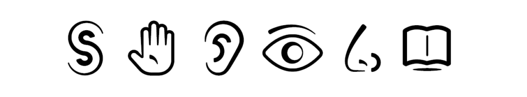
Working on the brand made us really think about what we were doing and why. We knew we wanted the Sensational Museum to not be overly visual and this led (after a lot of thought and discussion) to the realisation that this meant questioning the use of visual as the default option rather than solely moving away from visual communication. We wanted to ensure that where we had visual elements, these were the best, and not only, method for communicating what we needed to. For example, we chose not to have extra illustrations as part of our brand.
We also had to make a distinction between what was accessible and what people liked.
We made the decision that ultimately, as long as people could understand our logo – in whatever format – that was the most important thing. This meant that having a logo which could be effectively described by alt text and which featured visually non-confusing elements and easily readable font were all non-negotiable. Having colour combinations which featured a high enough contrast and were accessible for as many people as possible was also important. Our brand had to do more than just communicate the project in an aesthetically pleasing way.
It was important for us to get feedback on all aspects of our brand at different stages of the development. We consulted with critical friends who had lived experiences of partial blindness, colour blindness, hearing impairment, and various different neurodiversities. We were keen to imbed this feedback process into early stages of the development so that we were able to course correct as early as possible.
The First Design Phase
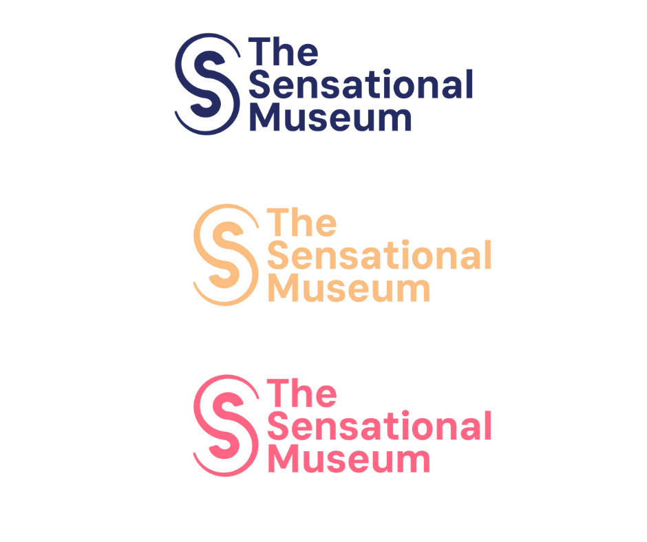
Wide Consultation proved to be a very useful approach, especially in relation to the first phase of the logo design. Patrick sent the TSM team three different design pathways, and identified the first as the one that he thought had the most promise. While the team largely agreed that the logo (pictured above) was the most “sensational” we quickly identified some major accessibility issues.
All of our neurodivergent testers (including the ones within the TSM Team) mentioned that the logo had an “optical illusion” feel too it which had a not overly positive effect on them, and many of our dyslexic viewers struggled to initially identify the shape as an “S”. The optical illusion effect was not only an issue because it interfered with peoples vision and/or processing. Optical illusions rely on sight and their effect is impossible to communicate in the same way with alt text. For us, alt text is an alternative but equal way of engaging with our brand, not a compensation.
This was so much the case that one of our suggestions for Patrick was to develop the alt text alongside the visual logo. He describes how “the idea of alt text being a means of describing a logo, which is a new thing to me, was quite interesting because I’ve always felt that if you can’t describe an idea very easily without looking at it, then it’s not a very good idea. So building that into the work was an awesome experience and something that I think I’ll probably keep going with because I think that it does create stronger work.”
The consultation process was vital for the creation of our brand. Both Patrick’s consultation with the TSM team and our consultation with “critical friends” on everything from the logo to the brand colours and font. But for Patrick one of the most important things for others hoping to undergo a similar journey is clearly communicating with their designer about their needs for the brand. As he explains, “I think [clients] need to be really clear and upfront about dos and don’ts early on so to avoid the designers going too far down the rabbit hole of creating things that they might personally like. I think that having a really, really clean clear brief is the first part and having lots of conversations before you get started”.
Moving the brand beyond the visual
Branding is still a very visual medium, but as Patrick explains, “even if your work that you produce isn’t 100% accessible for all audience types, it’s knowing that and making sure that people are catered for in other respects rather than just basically being ignorant to the many different difficulties people might have interpreting the work you created.”
For us this has meant creating an audio ident, with sound-designer/musician Rik Elliott, and the guidance of project partner VocalEyes, as well as a visual logo with alt text. We have also added recorded audio descriptions alongside our photos in the profiles section of our website (developed by thirty8 Digital). When we thought about the reason for adding visual portraits to our profiles – largely so that we would be recognisable – we realised that a more multisensory approach would also include our own voices. Because of this, the team recorded themselves reading their own audio description and bio.
Tips for creating an accessible brand
The experience of branding the Sensational Museum Project was an exciting and interesting one and left us with some useful observations and tips for those who want to work with designers on their own accessible brand:
- Make sure that you give the designers a clear brief with your accessibility requirements built into the heart of it.
- Do your research! Patrick explains that in hindsight “we could have possibly gone through a bit more time analysing things that do and don’t work from other brands and projects that are similar. I think that that could have been useful because we could have eliminated a few things or opened up a few conversations from doing that.”
- Sense check logos, fonts, and colours with a wide range of people. It’s really important to get feedback from people with a variety of access needs (but remember that no one person can speak for the experiences of a whole group of people).
- Really think about why you are choosing to communicate information in a particular way – do you need an extra visual element just because it looks nice? What are the additional ways that you can make this information available?
The results
We’re so pleased with the clarity and design of The Sensational Museum logo. Thank you to Patrick Fry, and all those who consulted to create our brand.